South Africa’s G20 Presidency (2025)
South Africa’s G20 Presidency (2025)
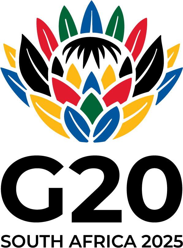
Logo – Main Element: King Protea 🌸
- National Flower of South Africa – symbol of resilience, pride, hope, and natural splendour.
- Cultural Significance:
- Crown-like petals → pride, identity, diversity, heritage.
- Hope & Regeneration:
- Ability to regenerate after fire → spirit of renewal, resilience after adversity.
- Natural Beauty:
- Striking and unique appearance → reflects South Africa’s landscapes.
Shape & Colours
- Semi-circular Design → symbolises unity, inclusion, global collaboration.
- Flag Colours (green, gold, black, blue, red, white) → diverse heritage, cultural vibrancy.
Theme: “Solidarity, Equality, Sustainability”
- Solidarity:
- Unified effort, empathy, cooperation, collective action.
- Ensures no country left behind in crises.
- Equality:
- Fair treatment and opportunities for all nations and individuals.
- Address systemic disparities (economic, social, gender, race, geography).
- Promotes global social justice.
- Sustainability:
- Meeting present needs without harming future generations.
- Balance of economic growth, social inclusion, environmental protection.
- G20’s role → pivotal in global sustainable development.
Importance
- Logo & theme reflect South Africa’s identity + global leadership vision.
- Connects cultural heritage with global governance values.
- Guides Sherpa Track, Finance Track, and High-Level Deliverables during its presidency.
Updated : 19 Aug 2025 ; 8:40 PM | https://g20.org/g20-south-africa/g20-logo-and-theme/
South Africa G20 Presidency G20 2025 King Protea logo South Africa national flower cultural significance unity and inclusion global collaboration solidarity equality sustainability Sherpa Track Finance Track high level deliverables resilience and renewal social justice sustainable development environmental protection global governance South African heritage G20 themes comparison